Friday 25 December 2009

Batman Arcane Asylum game usability review - the bad

So - I've finally finished Batman AA! What a game... It's pretty rare for me to complete a game, but I pulled the plug just a couple of days ago. Complete, with all 240 riddles done as well. Chuffed with that. Yes, yes, I know it's not that special, but I can now break the addiction.

So I've posted what I liked about the game. Now for part 2 - the bad aspects of the game usability/user experience. Just to be clear, the game is so good I feel I'm really having to search for improvements. I can't wait to see what changes they make to Arkham Asylum 2.


Fights can end anti-climatically

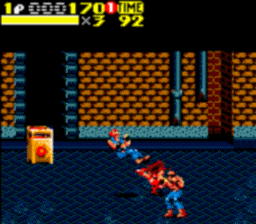
So the combat is great fun. Engaging, flexible, reactive, etc. But there is a small problem. Each fight ends with a slow-mo, alternative angle of the final puck/kick/throw/etc. But about 50% of  the time this dramatic view shows Batman doing a silly finishing move, such as kicking someone in the shin, or even missing the person completely! The slow-mo gives the player a long time to watch the final move... and see any flaws in the impact mechanics/silly underwhelming final moves.


The 'detective mode' is too powerful 

A problem I find with modern games is that it's harder and harder to see what can be interacted with, and what is just decoration. There have been a variety of different attempts to highlight 'interactive' objects. The tradition is to display the items in a different colour, make the items glow/glimmer or visually highlight the items in some other way. A good example is Bioshock - usable items have a shiny glow/glimmer. The problem being that this adds an artificiality to the game ("real bananas don't shine like that!").

Batman AA gets around this by offering a 'detective mode', where interactive objects glow orange. This ensures that the game world can remain 'pure' (no glowing objects here!) but means the detective mode is too useful. I spent most of the game with it on, meaning I missed out on the graphics of the normal mode.

Batman AA could supplement the 'detective mode' on top of the normal mode (so interactive objects can still glow and stand out, but the rest of the images doesn't loose it's colour). I'm essentially suggesting a combination (or at least a much closer connection) between the normal and detective mode. 

Other detective mode issues 

The 'detective mode' is so powerful, I played most of the game with it on. This lead to 2 problems:
  • It's hard to tell wardens (friendly) and inmates (not so friendly) apart. As a result I found myself attempting to creep up and knock out wardens throughout the game. Not a major problem, but it just pulled me out of the game-world briefly. This could easily be fixed with different colours for friendly and hostile people. The game already does this to a lesser degree, inmates with guns are coloured red, so unarmed inmates could be yellow and guards green or blue.
  • It's hard to tell when there's a wall between Batman and the person. As with the warden identification problem, I found myself attacking a wall (pretty embarrassing, as I was showing the game off to a friend at the time). Once more, it's not a significant problem... It just once more acts as a reminder that you're playing a game. The game could indicate to the player when there's a barrier between Baman and a person by using a darker/lighter shade of colour.
  •  
Equipment issues 

I had 2 issues with the equipment offered in Batman. I loved the pace they introduced more and more complex equipment as you move through the game (even updating older equipment to keep you existing gear fresh). However I had 2 (very similar) issues with the equipment controls:
  • Selecting another piece of equipment when under pressure was surprisingly tough. For far too many fights I tried to boobytrap a downed inmate with some rope or the electronic hacker because I failed to pick the explosive from the radial menu. The game could pause while the player makes their selection. Alternatively reduce the amount of time the player must hold a direction in the radial menu to indicate what equipment they need.
  • Related to this, there's no information on what equipment is selected. This leads to the same problem as above where I tried to use the wrong equipment at the wrong time for a situation - I just didn't realise I was using the wrong item. This may be a deliberate design choice - to save screen space/reduce clutter and/or because you don't have a HUD in real life. If not I would suggest adding a small transparent icon of the item. This should be placed in the corner of the screen, where the radial menu appears.
Sometimes unclear where to go next

In the previous post, I raved about the help offered when you struggled in set pieces, how the game tells you the best strategy to avoid the issue next time. Unfortunately the help isn't infallible. There are various points in the game where it's not clear where to go/what to next. I was wandering about in 1 corridor for about 5 minutes before giving up, and reading online that I missed a grate in the ceiling all along!

The developers should adjust the points where people regularly got stuck in playtesting and adjust the layout a little to accommodate this. They could find these points by defining the average time a player should get to the next section, and comparing it to the actual playtesting average. Alternatively the game could offer hints from the girl on the radio - e.g. "are there any vents nearby?" 

Quite a bit of repeats in environments

Another minor issue... again as there's so little for me to talk about here. A lot of the detail in the environments (furniture, files, etc) are repeats. Not normally a problem, but one of the details is a photo. This photo crops up over and over again all over the asylum. Either this person is the asylum equivalent of Jedward (for any non-British readers, best not go there) or they need more pictures. I've picked up on the pictures because faces are so much more memorable than tables, folders or anything else.

Batman's character

A minor issue is Batman's character. I enjoyed the game's story itself, good ol' fashioned trash. But through it all Batman himself was a little... 2 dimensional. Like the recent films all he does is grunt in a gruff voice to everyone he speaks to about how they should stand back and let Batman fix it. There's no uncertainty, no remorse, no... character. Batman's just essentially brought Joker into this island to cause havoc, killing many guards in the process - how does he feel about that???


And that's your lot! All in all a great game, with some very minor game usability issues that need adjustment. Personally? The most polished game I've seen in quite some time.

Wednesday 25 November 2009

Microsoft patents online user generated help


So, according to my sources, Microsoft is placing an online help system, with content from both developers and gamers themselves. I (obviously) think this is a great idea. Hints in games are of interest to me, and I just wrote about how great it was to see Batman Arcane Asylum using hints when players fell at set pieces.


I don't want to be told what to do, let me work it out in my own slow slow way... (I hate Cluedo)

They've got a tough balance to find between hints giving away too much and too little. I'm sure they've thought it through more then me but I presume levels of obvious-ness will need to be introduced (level 1 could be a cryptic clue, and level 5 could be being told exactly what to do), supported by user ratings (something that was noticeable for its absence in Spore).

My only concern is that the patent is too strong and hamstrings Sony/Nintendo/anyone else really getting to grips with help/hints and tips in games as well. With the major developers pushing each other to develop the best/most useful and user friendly hints systems for people, great systems will develop. I'm sure they won't be put off though.

The article mentions in-game hints for Super Mario Wii... I've just got that and it's waiting for me to find enough energy to fight it's shrink wrap off. Expect some feedback on the hint system (and the rest of the game) soon.

Sunday 22 November 2009

Batman Arcane Asylum game usability review - the good


I've been playing this for an age, and it doesn't look like I'm going to be putting it down until I finish it. So because I've invested so much time into it, I thought I'd split the assessment into 2 posts:

- Part 1 - the good
- Part 2 - the bad

Lets make 1 thing clear, I'm a big fan of this game. This part - the best aspects of the game's user experience, it's high quality game usability, will be EASY.

Good graphics

The game itself looks great (bar the character's comically huge muscles). The environments are detailed and busy. There's fairly few cutscenes, and those that are there look really good.

Engaging combat

As the director said they have put a lot of effort into the combat system - and you can tell. It's flexible and fun. It also looks great, dynamically adapting according to the situation.

In earlier brawler systems, the player controls the direction the fighter is facing, and is given buttons that do specific actions, such as puch/kick/throw/etc. This often led to the frustrating situation of a players character swinging just to the side of a bad guy whilst making no contact (usually whilst they watched, bemused).
A swing and a miss...

In this game players are given 4 controls (jump/avoid, counter, attack and stun), the player controls where these are directed with the control stick. The buttons don't do a specific action, but the intention of the button. So 'attack' may punch sometimes, and kick on others, or 'avoid' may jump over an attacker, or slide between their legs. All this is dependant upon the situation, meaning the games combat feel much more engaging and free flowing than others I've seen.

Players also recieve clear feedback on any combatants about to attack, a visual signal displays, giving the player time to counter or avoid the blow.

The system is pleasingly easy to pick up and understand, but I certainly feel I've yet to master it.

Good, well paced story line

The story line, while not groundbreaking, is pretty good. It keeps you moving through the areas with little feeling of being shepherded. It's also well paced, with a good variety of puzzle solving and fight scenes. Even the fight scenes are kept fresh with a nice variety of situations.

Help when you die at set pieces

One of the best parts of the game, the part I was most pleased about was the hints the game gives when players die at set pieces. For instance, when I was struggling with a boss fight - Bane - after being knocked down the game gave me a short message hinting to use my 'batarang' more.

It could consider giving more and more clues if players continue to struggle, or even offer to reduce the difficulty for that specific part of the game.

Quick save unobtrusive

A great feature I always love to see it autosave, it's great not having to worry about saved games. I know loads of games do this nowadays, but it's so well integrated I thought it deserved a special mention. Whoever put this into games in the first place was a genius...

Easy controls, gradual introduction of additional tech

The game has really well thought out controls (anyone who's read my blog all the way to this point will know this is a particular obsession of mine). It's very easy to run, jump, zip around, surprise thugs, etc. There's really very few points where you really feel you're fighting the controls to make the game do what you wanted (more on that in part 2).

The game also takes care not to introduce everything at once. Controls are slowly added with the gradual introduction of Batman's technology, meaning players are given time to get accustomed to controls before further complexity is added. This gradual introduction of complexity is a sure sign of a game developer taking care not to over-burden new players when they take their first steps into the game's world.

Even something simple like skipping cutscenes is well designed. Some games skip cutscenes after 1 button press - this means you place the controller to one side holding it like some delecate Ming china in case you hit a button by mistake. Batman needs 2 presses. The first press brings up the on-screen message allowing skipping, the second is the confirmation.

To be continued...

And there I'm just scratching the surface! For each one of these points I could go into more detail very easily, but that would mean I've got to spend more time writing and less time playing.

Generally, a great user experience.

Coming up - part 2 - the bad! (Dramatic music)

Friday 6 November 2009

Dead Space Extraction game usability review

Dead Space Extraction (DSE) - the latest on-rails shooter. Certainly a departure from it's predecessor (Dead Space, a space based survival horror), but is it any good?

I'm going to be uncontroversial and say it's... fine, as all the reviews have said. There are a few game usability problems that really don't sit well with an otherwise pretty good game.

Ignoring the story

1 of the big attempts DSE makes is to introduce a feasible story into an on-rails shooter. The story of survival against all the odds was a key part of Dead Space and there is an attempt to reproduce this here.

The problem is a feature built into the game that rewards players who don't pay attention to the cut scenes - you can do better in the game by ignoring the story.

Throughout play you are encouraged to key an eye out for items (such as ammo and weapon upgrades) you can 'grab' using a kinetic blog thing. These items can appear at anytime, during quiet periods, firefights and during cut scenes. The result is whenever you're not shooting, the best approach is to spam the 'grab' button at anything that isn't a blank wall. The net effect is that you spend very little attention on the story unfolding around you... or you risk missing out on loot.

"Sorry - I don't care what you've got to say, get your head out the way of that cupboard..."


There's a couple of possible solutions DSE could consider:
  • Don't offer items during cut scenes, the player can then fully focus or skip the cut scene as they wish
  • Alternatively, offer items in cuts scenes, but only after the first play through (perhaps at the higher difficulty levels), when players will pay less attention anyway
Audio blogs

1 of the hidden bonuses you can find are audio blogs, with short recorded messages from the (now deceased) crew. The problem being these are lost in the poor Wii Remote speakers. I had no idea what they were saying...

DSE should consider offering the option of playing the audio messages through the TV speakers.

Turning away too soon

Another problem that should have been spotted is the occasional point where the game turns away from a creature too soon, leaving you open to attack from behind. You're facing the wrong way and the creature is repeatedly wacking you over the head... and there's nothing you can do about it.

It just pulls you back to reality. An unwelcome reminder you're playing a game, and the game really shouldn't do that if it can possibly avoid it.

DSE shouldn't turn away from creatures whilst they're still alive - you wouldn't turn away from them in real life anyway.

Recognising your gun

The game offers you a variety of weapons to choose from. A problem is that it's often quite hard to work out what weapon you're using... Several look very similar. It's not a big issue most of the time. It doesn't matter what you shoot a creature with, as long as you don't accidentally equip your Super Soaker...

The problem is at a couple of points you need to use a specific gun - the rivet gun. It's not clear you need to equip a different weapon if you have the wrong gun equipped. It took two tries at one set piece to understand what I was required to do.

DSE could consider changing the aiming rectagle to clarify the difference between the guns, or include some clearer text when a gun is equipped. When the rivet gun is needed, and not equipped, ensure the player is made aware. The characters around the player could say something, or a message could appear on the screen.

Positives

Having said all this, it's still a great game. It looks great, especially for a Wii game, the sound is good and voice acting more than sufficient (first time I've played a game featuring a Dutch accent).

The story (if you attend to it) is good, it has a great shooting mechanics and some exciting set pieces.

DSE is Aliens to Dead Space's Alien - a great fun shooting-fest... just don't expect to get too scared whilst enjoying the ride.

How about you? What're your thoughts on the game?

Wednesday 28 October 2009

Late Wii Fit game usability review


Although Wii Fit Plus is already in the stores, I thought I'd get down my game usability thoughts on Wii Fit, and aspects of the game that should be considered for Wii Fit 3 - Wii Fit Cubed maybe...


Playing in a group

You can tell Wii Fit is designed to be played alone. Essentially all the activities require the Wii fit balance board. But we treated it as a party game. I had my family round my brothers copy, and we all did exercises together. However, after we all created our profiles changing between them was very hard work. After completing an exercise/minigame, to change player you had to:
  1. 'Quit' out of the exercise/minigame
  2. Exit the exercise/minigame 'channel' selection screen (yoga, muscle exercises, balance games)
  3. Exit the welcome screen
  4. Select the new player
  5. Select the right 'channel' on the welcome screen
  6. Select the right exercise/minigame
6 steps! Far too many for quick switches between players.

This sits poorly against the games apparent attempts to encourage group play. Whenever someone new enters the game, the other players are told of this, and says how good it is to play Wii Fit together. The game encourages people to play it together, in spite of the effort required to do so!

Wii Fit 3? Ensure there's a shortcut to change between profiles.

Personal details

People are sensitive about their weight. They don't like to tell others, and they don't want others to know. But when first joining Wii Fit, it announces your BMI for the whole world to see! There is no option NOT to see your BMI, it is plastered all over the TV. Anyone else in the room will have seen it.

The designers seem to have been aware that people wouldn't want others to see their details, and there's the ability to protect your information behind a password, but not on the first go...

Wii Fit 3? Offer new players the ability to NOT see their BMI when they join.

Multiplayer

When My girlfriend and I were playing Wii Fit, 1 of us did the exercise on the balance board, the other did the exercise alongside. We were exercising together. That's the next step... 2 balance boards on a machine at the same time. This would encourage us to use Wii Fit and exercise far more than any other change.

Wii Fit 3? Make sure people can exercise in a pair, using 2 balance boards at once (if they're sufficiently monied to have 2 boards).

Why I'm not getting Wii Fit

I really like Wii Fit. It's fun, and it really would keep me active. Anything to get my rotund behind moving is fine by me! BUT I'm not going to be getting it. Partly for the reasons above, and also partly because the game needs a large amount of space in front of the TV. I don't have that, and I can't get that... at least until I next move house.

Also, it's dependent on everyone around having a relaxed open attitude. To play Wii Fit in front of others is essentially to make a fool of yourself. You do yoga, poorly, you try and balance, you wobble, and you sweat. You need people around you who are willing to let you do all these things and not judge you. Alas, where I currently reside, I don't have these people. I can't exercise if front of my current housemates, I won't be able to relax. I'll feel like I'll be judged.

Ah well, just means I get to play it once a month whenever I visit my brother. No losing weight for me just yet.

Monday 19 October 2009

Charlie Brooker - Summing up the trouble with games

I read a great interview with Charlie Brooker yesterday. For those of you unaware of who Charlie Brooker is - He's one of the angry ones on TV. Pretty funny, and very... aware. Go see his stuff if you like someone being bitter. He's recently made a program called Gameswipe which this interview covers. Essentially Charlie, Mr Brooker, wanted to make a program about games that would be entertaining to both gamers and non-gamers. He speaks about the problems he faced:

"Games don’t realise how off-putting the complexity of games is to people who don’t regularly play them. Every gamer has experienced this, and again this is something we were going to put in the show. You introduce someone to something like Grand Theft Auto and they haven’t played a game since Streets of Rage when they were a student.
You sit there with them and within minutes you’re going: “No, press that button. No, that one. No, you’ve gone into crouch. No, don’t do that. That’s the map. No, you can’t run in that door. Why not? Well, you just can’t. It’s part of the scenery. I know you could run in the other door, but you can’t go in that one. Why? Because you just can’t.”
You have to sit there biting your tongue as they point the camera at the ground and run into walls. You forget how difficult games are to the non-gamer."
"It’s like learning a language. We’ve done it. We’ve played games for years. We know the shorthand. There was a bit of the show we had to lose where we talked about this. I know that if you’re running around and the camera’s in the wrong place I know that there will be an option to centre it behind me. A non-gamer isn’t going to now that unless they’ve poured over the manual. I don’t have to read the manual to know that."
I think this cuts straight to the nub of the issue. The reason why the Wii has been so successful is that people haven't had to learn how to play, you just do what you do naturally. More complex games need training, they need understanding, hard work and commitment.
"The closest analogy really is that it’s like we’ve learnt a language. Gamers are people who’ve learnt Esperanto."
Hope you're all keeping your Esperanto finely tuned - and spare a though for those starting out!


"How do you use this?" picture from YoshiVic

Sunday 11 October 2009

Light of Altair game usability - demo problems


I'll be discussing the game Light of Altair, specifically the game usability issues. This game was first brought to my attention by Gamers With Jobs (thanks guys!)

I really want to like this game. It's sounds great, GWJ wrote "Light of Altair has done a great job of distilling the elements that made games like Sins of a Solar Empire so addictive. If you prefer your strategy gaming in 20-minute chunks, Light of Altair is for you. "

BUT, I can't play it! Why? The demo is just too confusing.

A demo should showcase a game simply and clearly. It should not require the player to study any complex text or manuals, or leave the player confused on what to do next. After all the aim of demo is to ensure players have a seamless experience. They should move through the demo learning about and doing some of the things possible in the game without encountering any problems, otherwise it's goodbye possible sale. Players should see enough of the game to get a taste of what they can do, and be left wanting more. This demo unfortunately leaves me cold... Here's why.

Problems with the Light of Altair demo

Simply, it's confusing. The help messages simply don't tell me what I need to do, or how!

For example, I recieved this message:

"Now that the moon base has grown to a proper colony you need to construct a research facility and the power to support it."

The problem is, it doesn't tell me how I go about doing that. I eventually discovered the "research facility" had become available in the construction list and was able to move on... Why doesn't the game highlight that? Tell me in the message, or highlight the new building option visually.

Further on in the demo a message appeared:

"Commander, the construction of the moonbase is going slower than we planned. Please focus on the objectives otherwise we will be forced to relieve you of your post"

Huh? What was I doing wrong? The game didn't tell me, I was left along to work this out. How? Trawling back through all the messages the game had sent me recently (status reports, updates and crucially, orders). I found I needed a landing area on both my colonies - why not say that? Ok, moving on. Mission complete - next mission.

According to the mission summary at the top of the screen I've got to "Gain an income of $5000 a month". Easy. Wait... how do I do that? I've looked back through the instructions and I think this is the related instruction:

"Now you have an ore supply, you are advised to research and develop an Industrial Centre that can create tradable goods out of the ores on the planets surface. These goods can then be traded via a Starport to generate more income."

Ok, I got it. Build mines, then industry, and I'll make money through the starport. The problem is, I can't work out how! I've got mines, I've got industry, but I'm getting very little trade. I've missed something out. The help text is of no use, they're essentially worthless. The instructions fare no better. So I'm stuck. I've no idea how to proceed and I've just recieved the message of doom again:

"Commander, the construction of the moonbase is going slower than we planned. Please focus on the objectives otherwise we will be forced to relieve you of your post"

I'm out thanks...

What the game should have done
  • Given much clear instructions on how to do the objectives asked, e.g. "generate an income of $5000 a month. Income can be generated by..."
  • Given tips to the player to explain how to complete the objective they're stuck on, e.g. "you need to build a landing pad in all your colonies"
  • Ensuring the help text linked to much more in depth instructions/explanations on how the game worked, e.g. "For each mine, 2 industries are needed in the same colony"
Conclusion

Demos are possibly the most public facing aspect of a game. They cannot be some early levels of the game thrown together hastily. The whole experience the developers want to project to the potential buyers needs to be considered, and then that should be modelled. It will require further development time and resources, but a good demo should pay for itself by encouraging better sales.

Thursday 8 October 2009

Braid game usability assessment - is Braid a casual game?


Game Usability Review

Braid's great.


Positives

Introducing controls-
As well as being conceptually interesting Braid gradually introduces the game controls very well throughout the first level. It is essentially a training mode built into the game itself – there is no pop up or voice over explaining the controls. The required controls are simple placed on the screen near the obstacle:

Players are left to discover the controls themselves.


Feedback-
Braid also gives great ambient feedback. When reversing time a sound effect is used, the music reverses and the whole colour scheme, including the background changes. Clear feedback is one of the key features of a casual game.

Casual games as a whole-
In order for a casual game to succeed, there are a few restrictions it must place on itself in order to appeal to the casual gamer market. Braid does all of these well:

Less punishing – errors are easily fixed through rewinding time
Less complex – the control scheme is simple (control dimensionality of 3.5). Braid uses wasd controls for movement. This is fairly complex for a casual game, but I shall be returning to this topic at a later date…
Shorter – the game can be completed fairly quickly
Simpler – the games controls are simple, and the most complex aspect is the time travel
Less open ended – the only thing that is possible is to go through the game and collect the puzzle pieces
Clear feedback – it’s clear when rewinding time, and reminders of the controls appear on the screen whenever the game is played (not just on the first levels)

Negatives

There really is very little wrong with it! It seems mean to poke holes, but then again that's my job...

It could be argued that even when you work out the solution to some of the puzzles you are still forced to attempt the solution several times to succeed. Often seemingly completing the puzzle by chance. Essentially the game requires very precise movement and time control. Such precision implies the game anticipates being used by a hardcore gamer, as these are not the skills casual gamers posses.

Also – some of the puzzles are quite hard, there is little/no clues anywhere in the game (even the official game walkthrough tells you not to use any external help – to solve the problems on your own). If this game really was aimed at the casual gamer as well as hardcore, then more help should be used – clues that gradually reveal over time, or hints that appear after a certain number of failed attempts. So those players struggling are helped through the process.

So - is Braid a casual game?

I don't think so... Why? Especially after talking about how Braid is a great casual game? I believe Braid is a hardcore casual game - it's a casual game for hardcore players. This explains the high difficulty and high skill level required to solve the puzzles.

It's success stemmed from taking a good hard look at the successful casual games on the market and applying findings to a game aimed at the hardcore. The result? A great game...

The implications? Gamers like casual games too, and lessons can be learned from both ends of the game spectrum.

Wednesday 7 October 2009

My gaming history... or coming up!

The games platforms I owned (In order), and some of my favourite games from them... I'll probably be talking about some of these games and their usability in later posts.

- Spectrum ZX (New Zealand Story, HeroQuest, Batman)


http://tomdalby.com/retro/plus3.html


http://tomdalby.com/retro/plus3.html


www.angelfire.com

- Mac (Lemmings)


www.hampa.ch


- Game Gear (Sonic, Streets of Rage, Micromachines)


- PlayStation (Final Fantasy 7, Vigilante 8, Command And Conquer: Red Alert, Doom)
- MegaDrive (Brian Lara Cricket, Toe Jam and Earle, Gunstar Heroes)
- Playstation 2 (Timesplitters 2, Prince of Persia - Sands of Time, Super Monkey Ball)
- Wii (Resident Evil 4, Wii Sports, Super Smash Bros Melee)
- XBox 360 (Halo 3, Mass Effect, Bioshock)
- PSP (Locoroco, Final Fantasy - Crisis Core, Puzzle Quest)
- PC (Morrowind, Quarantine 2019, CounterStrike)

I slung these down in 5 minutes, so this is very much a work in progress... Hope you've got a few good memories from some of these! If not, check 'em out.

As I say I'll be posting usability focused thoughts on a few of these over the next couple on months.

Keep your eyes peeled and keep gaming...

Sunday 4 October 2009

Assassins Creed quick game usability assessment


Assassins Creed - PC version

I will be putting down my thoughts on various games from a user experience perspective here. Here's my first review...

Good game. Hard controls.

Positives
It's a great sandbox. Players can complete missions in a variety of ways, they're free to explore and experiment new techniques and find new
ways to play - always a good sign. Allowing players to play their own way allows players to entertain themselves - messing around or playing seriously whenever the feel like doing so.

The game encourages flow, it's so easy to run, jump and climb all over the city. Very little cognitive effort is involved in performing actions - players just move without having to stop and think what to do next.


Negatives
The controls are too complex.

*Please note - I'm discussing the PC version*

To get a gauge of how complex controls are you could use
control dimensionality (as described by Activision Central design, and 21st Century game design). This pulls a games controls into a number, so you can do direct comparisons with other games to see how much more or less complex 1 games controls are compared to another. Simply put, the less complex a games control, the better. The control dimensionality is calculated below:

3D movement (in/out, left/right, up/down) = 3
+
2D camera = 2
+
8 key actions (left hand (high/low profile), right hand (high/low profile), run/walk (high/low profile), head, target lock) = 8 * 0.5 = 4

Total = 3 + 2 + 4 = 9

There's no way of knowing if this is too high or too low without comparing it to other games. I'm going to stick my neck out and say it's high... As this blog continues we'll be able to compare this to others.

The complex controls are accentuated by the game using modes (high and low profile). This means the same buttons perform different actions depending on the mode the player is in. This can cause real problems. In my experience modes will always cause confusion, and especially when under time pressure (like playing a game).

Also the game is a poor port onto the PC from the console versions. The on screen advice tells you to press the trigger button (advice for those using the 360 controller). The manual isn't much help either... There's 6 pages summarising all the actions possible, but I spent about 5 minutes trying to work out what buttons were for what actions.

Recommendations
The game controls were a risk. Ubisoft should (and probably did) have tested the controls with users as soon as a working prototype was available, before committing to any significant degree.

Also take more care and attention on porting to the PC. Put the right controls on the screen, or at least remove the on screen prompts. Ensure the new manuals for the new version include the controls.


What do you think? Do you agree with my thoughts? Or do you think I've over exaggerated it's problems?

Friday 2 October 2009

Hello and welcome

I've set this blog up to post my thoughts and feelings on games. Not just any thoughts and feelings. It's got a special focus - game usability. Hardly a shock with the blog name as it is, but there you are.

I'm a user experience consultant. I have been for several years now and I'd like a change. I want to get into game usability. Why you ask? Playing and watching others play games for a living? Sounds fun to me. Also it'll be great to always be working on projects I am genuinely enthusiastic about.

Anyway, what am I going to post here? I'm aiming to showcase what I can do by putting reviews and assessments of games, interesting findings from research, and my thoughts on games in general.

Feel free to suggest games you'd like me to take a look at (anyone got some homebrew games out there?).

And anyone who has a game usability job going? Lets chat!