Saturday 11 December 2010

Lobby process fail

I was reading a (rather old) review of Castlevania: Harmony of Despair. There a very telling paragraph that comments on the porcess players go through in the lobby to play online:

"For a multiplayer-focussed game, the lobby system is a bit of a mess. There's no way of searching for games by what level is being played - or difficulty for that matter - and it's largely due to the fact that the game makes you lock a party in before you can even set up what you're going to do. This invariably leads to most online jaunts being one of two thing - getting booted out of games when everyone wants to play the last level on Hard and you're not there yet, or being on the other side and having to guide beginners through early stages again."

Assuming this is true, this is a real significant usability issue. The process for players to get online, and get playing should be as painless as possible - but they also need control over WHAT they're playing.

The only reason I can think of for the process to be set like this is because the designers were unsure of the numbers of players who would be playing online, and so thought it best just to put everyone online in 1 group.

The solution

The paragraph says it all really. This is the current process:

Join group -> Select difficulty and level -> Play (or drop out if not to player's liking/can't play)

An alternative process could be:

Select difficulty -> Join group -> Group vote on level -> Play

The initial selection (difficulty) is essentially a filter, so players looking to play at the same level filter out the other players. Once the group is formed, there's no point selecting a level that not all the players can play (so they group must split immediately), so only levels available to all the players
should be offered.

Ideally the initial filter would also include level choices, but if there were concerns around the numbers of players this could be removed/left out to ensure sufficient numbers of players could find each other.

Thursday 4 November 2010

Great quotes from a lame developer

Logo still needs work...
I've just read a great mini-article interviewing former Crystal Dynamics programmer Bradley Johnson. In it he says:
Making iPhone games is quite a bit different than console games, if the audience can't pick up your game and figure out what's going on in 30 seconds then you've probably already lost 95% of your audience. 
This man speaks the truth... He then goes on to say:
That's why playtesting has been so important, so that we can recognize how people play the game and fix the problem areas
What quotes, two real gems there. Couldn't have out it better myself! Go check out his game here.

Wednesday 3 November 2010

Fable 3 game usability review - Part 1

I've just picked up Fable 3 and I thought I'd sling down my early thoughts in a quick game usability evaluation for you all to enjoy (I haven't reviewed any of the other Fables here, so I'm taking some series staples and talking about them, as well as new features).

Some positives

Quick! After that fairy!
The trail

Everywhere the player goes, a golden sparkly trail leads out from the player to their next quest location/objective, meaning the player knows where to go at any point. This trail is a great way to ensure the player can wander off and explore - safe in the knowledge that they can find their way back easily afterwards.

Genius! For 2 reasons - it encourages exploration and ensures players don't waste time looking at maps, getting lost and generally not playing/doing what they want to do.

Some players might feel that they're being handheld, that it removes some of the challenge. However you could counter this by saying that struggling with maps isn't one of the challenges the game designer planned, so anything that eases the pain should be encouraged.

The RPG lite


Fable 3 uses a simple levelling/skill tree process, avoiding the use of stats. This fits with the casual approach the game takes to the whole RPG genre.

Most RPG games are very statistics heavy ("Take this 6-7 damage +3 poison damage thimble"). Fable 3 has taken an alternative approach. All levelling up is handled by opening chests which improve your various powers along the 'Road to rule'. This keeps all levelling simple, encouraging players to not think too hard about what to unlock next.

One negative aspect of having physical chests is that they are spread out in this 'Road', and if left unopened can be a real trek away. I had a bit of a journey to get back from halfway down the road to the first set of chests (to unlock a spell I finally decided I needed).

The pain is eased in 2 ways -
  • Short cuts are offered back to where you've reached on the 'Road' (but this only goes 1 way, you still have to trek all the way back to the chests you need in the first place)
  • Chests aren't reliant upon players opening previous chests first before giving them access to the next level (e.g. you don't have to have opened pie making level 1 to open pie making level 2). The game simply rolls the costs of the 2 levels together, so the player can essentially unlock them both at once. This means the players don't have to hunt for the missing chest before they can open the shiney new one.
Sense of humour and feeling of life


Boiled egg anyone?
The game has a very good sense of humour. This feels right, and fits with the game world. It has the added bonus of allowing much greater variety in the side quests, ensuring the quests remain fresh (the role play game and bickering ghost brothers being particular highlights so far).

This is supported by an excellent voice cast. Notables include Dame Judy Dench, John Cleese, Stephen Fry, Jonathan Ross, Mark Heap and Julia Sawalha, among others... I could go on! Quality voicework can be found throughout the whole cast, and it complements the writing wonderfully (Although as a big radio 4 fan it's slightly disconcerting to hear voices from Nebulous and the Museum of Everything!).

Friends' stats


During loading screens, your statistics are displayed, alongside your Live friends stats.


I know several other games do this, but this is the first time I've played a game at the same time as a friend. This creates surprisingly compelling pressure/competitiion to keep up/get ahead of your friend. It's sucked me in, that's for sure!


It's always entertaining to see how many children my friend has spawned in this play session...


The 'Sanctuary'

The sanctuary is essentially the pause menu - the central hub where you can change weapons, game settings, join an online game, etc. The novel approach is that these options are controlled in physical 'rooms' - rather than through a menu.

It's certainly... different. I remain to be convinced by it's gain in the user's experience.

It takes longer to do anything, it's particularly difficult to change quests/missions, but at the same time I think it will be more easily understood then a system of menus by players new to the RPG genre.

Conclusion part 1

In short a very good game. Quality throughout, with some nice touches which could help new players pick up the game and get playing more quickly and painlessly than other games.

Coming soon: The BAD. Poor design/development choices that I feel will interfere with people's enjoyment of the game.

Monday 25 October 2010

You're not welcome at Home

Home isn't where my heart is
Just a quickie - I've recently treated myself to a PlayStation 3. I was looking forward to trying out PlayStation Home. An interesting concept, rolled out to great fanfare a while back, not really knowing any PS3 owners enough to really find out more about it I recently downloaded it to see where it had got to.

My impression

I'm amazed by the poor introduction of Home.

The avatar creation tool was limited. Home come I'm able to make pretty good versions of myself using a Wii and an Xbox, but not using Home. 

After a very brief hello, that really didn't enlighten me as to Home's purpose, I was taken to an empty apartment, told a little about it before returning to the main screen once more. I really felt I'd been left adrift by Home. Not welcome almost. If Home isn't going to show me around, explain it's purpose or make me feel welcome, I really fail to see why I should bother with it.

I've now had my fill of Home, it failed to ignite my imagination. I recently read a great article about effective ways to make a tutorial, the introduction to Home (I can't even bring myself to call it a tutorial) definitely isn't one. The Home intro needs to:
  • Explain its purpose clearly
  • Show users how to do the purpose
  • Offer access to further tutorials about each aspect of Home, that players can access whenever they want
As it stands Home expects players to invest precious time and effort learning what Home is for and how to do anything.

I've got no plans to be going Home any time soon.

Thursday 19 August 2010

Gaming Grandmas

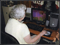
Prepare to see more of this
An awesome blog post from Belinda Parmar. In it she describes some unexpected behaviour by over 55 female smart-phone users. What was most interesting to readers of this blog is their use of games:
When it comes to downloading apps on their smart-phones, one in five women stated that their favourite app was a gaming app
Gaming Grandmas? Oh yes. It's great to see, it really is.


Many of those over 55 smart-phone gamers will probably be discovering electronic games (or at least game genres) for the first time. It's safe to say the majority aren't going to be classed as 'hardcore gamers'. They will need user friendly, welcoming (casual) games.

If you want your target audience to include these older smart phone users, then a big focus on game usability and game usability testing will be needed. As the article points out, 1/3 of the UK population is over 50.

The baby boomers are starting to play games in real numbers. Here they come.

Thursday 15 July 2010

Torchlight - Game usability quick review


I’m playing Torchlight. I’m stuck.

Not because it’s too difficult, quite the opposite, it’s too damn easy.

Right at the start of the game I was asked to select a difficulty. I didn’t want to be taxed too much – this was to be my “switch off in the evening after a hard days work” game so I decided to select ‘Easy’. I now regret the choice.

About 3 hours in, the game is literally a breeze. I heal faster then the bad guys can damage me. The only way I realise I’m in a boss battle is that they take more than one hit, and can cause me more than 1 point of damage. After realising the game wasn’t even a small challenge any more, I decided to ramp up the difficulty – only to find I couldn’t. The difficulty I selected at the start – before playing any of the game – was final.

Why? Why force the player to decide the difficulty at all, especially before play?  And then – why not allow them to change it later? That’s poor design.

There are many excellent examples of game difficulty adjusting to player skill/level (a la Oblivion), or perhaps Torchlight could take a leaf from Call of Duty 4’s book (A mini level to assess the player’s skill level). This could also allow players to try out the different character types before making a commitment.

Giving game difficulty control to players is rather dull, it’s not sexy or glamorous, but it does need to be implemented well, or it can ruin a play experience.

Sunday 13 June 2010

The poor usability of friends lists

Just read a great interview with John Vechey, Popcap co-founder. He has some great opinions about Facebook and friends lists:
I'm very pro-Facebook. I never want to make a friends list again... I hate making friends lists in games. Take League of Legends - I was playing for three weeks until I found out some of my friends had been playing!
The problems with friends lists as a concept include:
  • For some games you have to re-create the list each time
  • The need to know which of your friends to add - you've got to stay in contact externally to keep track of who's playing what
  • They involve the input of a complex string of characters (an email of series of numbers). This is less of an issue with a PC, but with consoles this turns into a real effort
Efforts have been made to reduce the pain for example using shared lists on the consoles and Steam, among others. But why bother at all? Most people have a ready made friends list in Facebook.
I've seen Blizzard is looking to get into Facebook - and it's not a moment too soon!

There are some provisos however:
  • The game must not spam/announce to all your friends on Facebook what you are doing, at least not by default (I'm sure several people don't want all their friends to know they're playing Dead Or Alive Paradise!)
  • The game should allow you to add other people the traditional method (many people aren't 'Facebook friends' with everyone they play games with) 
Further research would have to be done with gamers to find more provisos and the ideal behavior of a friends list when merged with Facebook.

The additional benefit of keeping track of achievements and progress, combined with player controlled (and I really mean player controlled) invitations would certainly help pull gamers together.

Saturday 24 April 2010

Free game usability review

So I've been writing reviews for a while now... Mostly big games, post release.

I think it's time to change that. There's little point analysing a game that's already out there - it's too late to make any significant changes. So I'm throwing my gates open to you all (as it were). If you've got a game in development, and want a game usability review (I'm looking at you, small indie developers and students), let me know!

And for all of you thinking that you don't need it... (not sure why you'd think that if you've made it to this site) what is there to lose? Free's nothing. Plus - free advertising here.

Note - I will write about my experiences in this blog, but I'll get you sign off anything I put down before it goes live. Can't say fairer then that can I? Anyone who's interested email me. alistair dot gray84 at googlemail dot com...

Monday 12 April 2010

Wii Fit Plus game usability review

I recently did a game usability review of Wii Fit. I  suggested a couple of changes, and ended by saying that I wouldn't be getting it myself due to a lack of space - at least until we move. I haven't moved, but I have broken and got Wii Fit Plus. What can I say? I'm weak. That and whenever we visit my brother, a proud owner of Wii Fit, the girlfriend and I are always on it. The decision was made (... that and we suddenly realised we spend far too much time sitting on our behinds doing very little).

So - my game usability review for Wii Fit Plus.

In my last write up I suggested for 3 key changes.
  1. A shortcut to switch between players profiles when several people are playing together.
  2. A choice to allow people to hide their BMI/weight from other players.
  3. Multiplayer - to allow people to play together.
I made these suggestions after playing the original Wii Fit. This was before I got my grubby hands on Wii Fit Plus. So how does the second iteration of Wii Fit do? When compared to my suggestions I'd give it a 1 out for 3.

It DOES offer a shortcut to switch between players. You've now got a small button in the bottom right corner, allowing you to select other Miis. This means if/when several of you are playing together you can much more easily switch between you (meaning the balance board won't complain when someone else tries to gets on as you).

It DOESN'T allow players to hide their BMI/weight when joining.

It DOES allow exercising in a pair - but only jogging, not anything else. This is fine, not many houses have multiple balance boards anyway. The game also offers a multiplayer option, allowing lots of you to play together.

So why not 2 out of 3. The 2 it DOES do aren't done properly (see below).

Alrighty...

Issues

The 'multiplayer' mode doesn't save your 'progress'. The length of time you spend playing and the high scores you achieve are lost ("fit cash")(both when you leave multiplayer mode and in someone elses training after using the 'switch' control). Why? They should be saved in the player's Wii Fit profile (if they have one).

Switching between players isn't a true 'switch'. The advanced levels a player has unlocked aren't offered - only those associated with the original player selected. Also getting a high scores doesn't have any effect (i.e. achieving a good score won't unlock the advanced mode). However if you are the original player selected then you CAN unlock advanced modes.

Players are going to get confused - "Why can't I play advanced cycling? I unlocked it yesterday!", "How come you just unlocked advanced? I got a higher score!". The game should properly switch between players, all unlocked advanced modes for that players account should be offered, as well as allowing the player to unlock further advanced modes if they do well.

Whilst the game does offer 2 player jogging, only 1 '2 player' mode is offered. I'm not sure why a 2 player option isn't offered for all the jogging modes?

Additional suggestions from my girlfriend - The ability to turn off tips. She sees them a "patronising, annoying little shits". Also - to have the ability to play without music. We wanted to listen to a new CD yesterday, but couldn't as the games often needs sound to play well. Joggers often have an MP3 player with them - it's easier and more fulfilling to exercise with your own music playing. The game should support this.

General list of positives

So I've been rather down on the game. But overall I am a fan. Here's some positives:
  • The game uses other Miis whilst playing - there's nothing like throwing a snowball at your mother or seeing your housemates doing the activities with you.
  • Allowing you to create and personalise your own exercise regimes is a nice touch, meaning you don't have to interrupt your heavy yoga session selecting the next exercise. BUT the process to set up the regimes is FAR too complex (a blog post in itself I believe...)
  • The Wii Fit age is a great way to both measure your progress and get competitive with others - I went from 20 to 38 years in a day though, so I'm not entirely convinced of it's reliability.
  •  Great new games (cycling, segway, tilt city and the obstacle course stand out) and more advanced versions of old classics (table tilt and balance bubble)
  • Overall a good variety of activities - yoga, muscle workouts, balance games - there's not many games about that allow you to do some yoga, then some kung fu, before finishing off flapping like a chicken!
As I say, I'm a fan of Wii Fit generally, it's a great game. But there's lot of little snags that noticeably reduce the user experience in this version. This wouldn't be a major issue, but a lot of these are pretty simple stuff, and as I mentioned before, this is a sequel, this sort of minor issues should be ironed out by now. Nintendo must try harder...

Monday 29 March 2010

'I can't work the buttons'

Interesting reading in 'Games TM' magazine this month (number 95, with Red Dead Redemption on the front cover).

In it there's a quote from Jens Matthies, creative director of Machinegames. The discussion is around violence in videogames... Matthies says that violence isn't necessarily the reason non-gamers don't play games, but rather the gaming knowledge needed to start hasn't developed. Definately no arguments here!
Now, the quote - "I remember we tried testing The Darkness with a group of non-gamers and it was a complete disaster. They couldn't even work out how to leave the first room. They just didn't understand the controls or how to interact with the game".
I've not played The Darkness, but the concept of playtesting a complex 1st person shooter with non-gamers is... interesting. The playtesters would need to get some help to get going, and they'd spend their time coming to terms with the concept, rather than the game.

The key question you must ask before recruiting for playtesting - who's your audience? If the developers of The Darkness were genuinely targeting non-gamers from the outset it's a valid to bring in non-gamers... And the results should have led to some major design adjustments. If the game isn't aimed at 'non-gamers' - what will you gain by playtesting with them?

Everything you test will have a target audience. That is who will be using the product, that is who will buy the product. So make sure they can use it. If you have some extra budget, perform more rounds of testing, don't expand the playtesting audience to see how you can do in other demographics.

Additional rounds of testing allow you to "mark your homework" - you can check and see how well your changes fix the problems encountered, and make sure no new problems are introduced.

Reason for delay...

In my last post I said I was going to conduct an assessment on achievements in iPhone games.

That's had to be put on hold until recently due to the magic in my girlfriends iPhone running low - it's had to be sent away for repairs. What else has caused me such delay? Plants versus zombies! Full review coming soon.

Sunday 28 February 2010

Pocket god game usability playtest - part 2 - solutions

Ok, so, first of all the game usability issues encountered by the game tester, broken down into high, medium and low priority:

HIGH
  • Game aims/type unclear
  • Help too long and unclear
  • Overwhelming amount of functionality
MEDIUM
  • Controls not clear initially
  • 'Open Feint' wasn't explained
  • Started at episode 29 with no explanation  about the earlier episodes
LOW
  • The request to allow push notifications was unclear
  • Unclear when items/environment options are toggled on or off
* Disclaimer * 1 play test is far too small a number to truly be able to draw conclusions on the issues in the game (you need at the bare minimum 6 to be able to start drawing more reliable conclusions), but I'm running with what data I have...

Game aims/type unclear
Traditionally people know what type of game they are buying/getting. The game's background or premise is typically setup using an introduction movie. Pocket God cannot rely on people knowing the type of game, as people often download iPhone games on the spur of the moment. This leads to players not knowing what they’re getting into. This is exacerbated by not providing an introduction to the game.

The introductory page to the Pocket God help states:
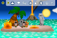
Welcome to the Island of Oog, on an island inside your iPod/iPhone live the Pygmies, a tiny race of people that worship an unseen force... YOU. You are their God and it is your responsibility to keep them in line and guide them through their ongoing adventures.
I feel this doesn't sufficiently explain the game. The playtester thought she had to try and keep the pygmies alive/prosperous. This was why she got so upset when the pygmies started dying. The introduction needs to explain that the fun starts when you're willing to let the pygmies die, as they can be replaced easily. 


The intro text should be clarified, making it clearer what the aim of this game is. An introduction could also be added (this doesn't necessarily have to be a movie, it could be a series of images like Beneath a Steel Sky).

Overwhelming amount of functionality/Help too long and unclear 
I recently praised Batman Arkham Asylum for its well paced gradual introduction of controls. The problem with Pocket God is that as there's no storyline, there's no clear path through the game through which to introduce the different features. There's no storyline, all the functionality is available from the off, leading to this feeling of being overwhelmed by our playtester.

Pocket God could add a tutorial, introducing players to the different 'activities' available... But this undermines the spirit of exploration and discovery that the game relies on ("ooo look, I can throw them into the volcano!").

An alternative - I think the best way for the player to learn any game is to gradually seek out new functionality at their own pace. If Pocket God initially loaded with just 1 area available, this could act as a 'nursery' area for the player to come to terms with some of the more basic controls before allowing the player to approach the other areas in their own time, downloading them whenever they felt ready. This could also be applied to the different 'episodes'.

This approach of essentially splitting the areas would allow the help text to be split up. Of the 34 pages of help, 10 are generic, 4 are for 1 area, 3 for another, 5 for a third, 3 for a fourth... and 3 for a fifth. A lot of these pages are presented when they aren't relevant - why do I care about the T-Rex when I'm in the underwater area? If the pages in the help text were context specific (only show the help text for the area I'm currently in) this would simplify the text significantly.

The help text could be split into 3 sections to further reduce the number of pages presented at any one time:
  1. Overall controls
  2. What can be done here?
  3. Open Feint/Social
Controls not clear initially
The controls are translucent. While it makes sense to try and be as efficient with screen space on the small iPhone screen, there's a risk (as seen here) that players miss the controls entirely.

I would suggest researching a little more to see how often this problem occurs with new players, and if it is a common problem to offer an option to set the controls to opaque or translucent, with opaque the default selection.


'Open Feint' wasn't explained
What is 'Open Feint'? Is it another app? How is it related to Pocket God? None of these questions are answered sufficiently.

There's no attempt to sell it at all. Imagine users as surly teenagers (several are) asking "what's in it for me?". Explain what's to be gained in signing up to this thing, e.g. See how your friends are doing by signing up to Open Feint - think Facebook meets games! (I stole the end from the Open Feint site).

As a backup, ensure a negative decision can be reversed easily (I think this is already the case, but couldn't be tested as the playtester signed herself up).

6 of the help pages attempted to explain Open Feint, but do a poor job. The explanations are text heavy, and I was unable to find the pages demonstrated when I attempted to use Open Feint myself. I think this functionality needs a video (implausible on the iPhone) or explanation text in the application itself.

Started at episode 29 with no explanation  about the earlier episodes
It must be good advertising to display clearly each time the game's updated... great for return users, not so good for first-timers. As the play tester said - "Episode 29? What about the other episodes???"

There's a couple of options with this issue:

Option 1 - do nothing. It makes no difference to the player, this problem doesn't interfere with their play (although it does un-nerve the player slightly during their initial play).
Option 2 - give the player control to advance 'episodes' at their own pace. I.e. they initially start the game in episode 1, with an option to move onto 2, 3, etc whenever they chose.
Option 3 - don't show the episode number when the game is initially loaded, display only on subsequent openings of the game.

The request to allow push notifications was unclear
This will be a common issue for many apps. What are 'push notifications'? And even those who know what they are, how often will they be coming in?

I just realised I didn't really know what they are, and after 5 minutes of studious internet research I'm now... none the wiser. I can't find much about what they are, other than they're the little red blogs apps get in their corner to let you know something's happened.

Much like the Open Feint issue Apple need a 'What are push notifications?' link each time this question is asked. There should also be another link/a following page detailing exactly how the push notifications will be handled by the specific application. Allowing users to read and learn about unknowns will massively increase the likelihood of people agreeing to said unknowns (or 'knowns' as they would then be... known).

Unclear when items/environment options are toggled on or off
I was working with a client just a couple of weeks ago who encountered the exact same problem. The 'on' selection looked very similar to the 'off' selection. This meant participants were forced to switch the option on and off several times before they could see the difference.

The solution is to differentiate the two states more clearly. This could be done by changing the on/off state from a subtle glowing around the silhouette to clear colour changes. Or using ticks and crosses alongside the silhouette.

Conclusion
Pocket God needs several changes before I could say that they support new users. It appears to have suffered game usability growing pains. Designs that were suitable initially have suffered with the increase in content. While I'm sure more experienced players will be able to overcome several of the game usability issues discussed with no problems, the issues will remain for more 'casual' gamers.

Next time - A discussion on 2 attempts to introduce achievements in iPhone games...

Friday 29 January 2010

Pocket God - game usability playtest part 1

I recently ran a game usability playtest of Pocket God on the iPhone. Why that game? It's developers Bolt Creative recently claimed that it's been downloaded 2 million times. I was intrigued to see the appraoch the developers took to keep the game fresh - to release regular free updates (30 "episodes" over just over a year).

With so much additional content being added to the core game I was curious to see how the game introduced itself to a new player. I decided to conduct a very-mini playtest, consisting of 1 tester. Step forward test subject number 1 (the girlfriend).

Test subject number 1
Preferred genre -  Strategy/Puzzle
Favourite game - Ceasar 3
Systems owned - iPhone and PC/Mac (some play time on the Wii)
Average time playing per week - 2-3 hours

*Disclaimers*
  1. I had no contact with the game before the playtest -  I didn't know anything about the controls or content. Not ideal for a playtest, but it was necessary (the iPhone used for the playtest was owned by test subject number 1).
  2. I deliberately didn't allow test subject 1 to read any information about the game before the playtest - not even the reviews. She would normally have read the reviews, and learnt about the game to a much greater degree before purchasing. A lot of the issues encountered wouldn't have been encountered in real life (as the tester would have read around the game before commencing). I wanted to enact a spontaneous purchase.
The playtest

I'm just going to write what happened:

Before the game loads, an 'Open Feint' window appears and requests to use the players data. The tester (hereafter referred to as her, or she) was unsure what this was for. She thought it was a different application altogether and guessed it was some form of social tool (it is, but there's no explanation - what it is, or what you'd want to sign up to it for).

Next she asked if they want push notifications. "Are these warning messages? How often will I be warned?"

The game starts and informs her that episode 29 is loading - "Episode 29? Why start on episode 29?"

The game loads with 1 pygmy on the screen... it picks up a fishing rod and starts to fish. Almost immediately it is pulled into the sea and eaten by a shark - much to her dismay. She's left with no one on the screen anymore. She doesn't notice the 'add pygmy' button in the top of the screen. She gets distressed.

With some assistance she notices the controls in the top of the screen. They load the help, which offers some explanatory text... but this is rather small and hard to read. There's a total of 34 help pages - too much for her to take in. They started reading... then gave up. She gets distressed. "Ice monster? What? I'm meant to throw the pygmies at the ice monster? How? Why?"

She creates a couple of pygmies and tries dragging one around. Succeeds in dropping the pygmy into the sea, where it quickly drowns before she can pull it out again. She gets distressed.

After a couple of minutes she is starting to get to grips with the controls. However, they still felt overwhelmed - "There's too much...".

Pulling up the map she accidentally takes the pygmies to the 'underwater zone' "Are we underwater now? Why?". She panics, fearing the pygmies would drown.

Finding the toggle controls (where the player has the ability to toggle various interactive aspects of the zones on and off). She toggles a couple of options, but is unsure what they control "Are they on or off? What are they?"

After 5 minutes of the playtest she abandons the game. "I just don't know what to do..." She believed she was playing the game incorrectly, that there was a way to be benevolent and save the pygmies from their rather gruesome fates.

After playing

After playing she went online to see what she was missing. Reading the Wikipedia entry, the tester realised the whole point of the game was essentially to torture and kill the pygmies in a variety of amusing ways... This didn't appeal to them. The game was not to their taste, but they were still able to find several issues. The biggest being:
  • The game never introduced itself to the player - there was insufficient help and no tutorial. It was also unclear exactly what kind of game it was (a sim-killer)
I'll discuss the other issues, and how they could resolve some of them next time!

Friday 22 January 2010

Context of game play is key - Part 2

I'm playing a few classic older games at the moment:
  • Fallout 3
  • Mass Effect
  • Bioshock
All great games circa 2007-8. Why so old?

Up to recently, I didn't have much of a chance to play games. I lived with my Grandfather, he had 1 TV, he watched it a lot. This meant if I wanted to play any console game I had to wait for him to walk away from the TV (not a regular occurrence). Then I would sneak on and have a gaming frenzy.

Unfortunately as that wasn't that often, I was reduced to playing games on my old conked out PC. In the cold cold cold spare bedroom. If I wanted to play a game I'd have to wrap up like a Michelin man. Unsurprisingly I fell out of the habit.

"I'm off to game!"

That's a major problem with games, they take up an entire living room. If you're playing, it's hard for someone else to be in the room doing something else. One of you will distract the other. There's a great shot of me playing Dead Space Extraction in the front room with headphones on, trying to be discreet. I managed to distract the housemates watching TV by flailing my arms around (physical attacks in the game) and jumping (scary bits).

The solution? There is none. Get headphones, get a PSP/DS... That's about it. You're then either still taking up the TV or playing on a much smaller screen. Players know you need a room, it's one of the prices of entry (you know, in addition to the actual prices for games/equipment themselves).

It also has an implication for how you go about playtesting games - natural environment (in the lab or in the players homes), familiar company (friends and family), etc, etc. This is a further blog post for another day though...

Coming up shortly - iPhone Pocket God playtest! oooooo...

Sunday 10 January 2010

Context of game play is key - Part 1

The world needs me. I'm busy saving the world.

I'm mid-way through Final Fantasy 7, a game that blew me away last time I played it. As soon as I saw it on PSN I know I had to go back and play it all over again. I spent 2 late nights trying to coax PSN to accept my hacked PSP. It was hard, work, but I did it!

Final Fantasy 7. Great game. I clocked 70 hours when I first played it through the first time around on the PlayStation 1. Now I'm playing it again. I should be loving it, but I'm bored... it's not the same as last time. This time around, it's different. Things have changed, but what?

PSPortable

The PSP is (obviously) a different piece of equipment to PlayStation 1 - you play in totally different situations:

PS1 - Large screen, good sound, non-portable.
PSP - small screen, poor sound, portable.

I think this is the key problem. I now play the game in totally different situations than previously. The first time through it was only played in the front room. On my own, with a large screen dominating my vision, and with nothing else going on.

Playing on the PSP means I can play the game anywhere. This is both a blessing and a curse. It means I can play ANYWHERE! I've played whilst cooking, in front of the TV, whilst on the train... other things are going on around me. I'm not as wrapped up in the story as I once was, my attention is now split between the game and everything else occurring around me.

I can also drop out of the game whenever I want. I'm not obliged to listen to this or that cut scene, I don't need to stick with it to the next save point.

This problem is made worse because I often play the game without sound, so I don't interrupt people around me. I've removed one of the key affects the game has on me. Without sound I've now got to rely entirely on the visuals for atmosphere. But with a smaller screen as well as other things going on around me it's a lot harder than it once was.

What else has changed? Well...

Story

I played through the game before, so this time I know what's going to happen. I can't remember the details, but the main arc and twists are still there. The story itself now seems at little melodramatic.

The result is that I'm not gripped as I was before. I can put it down and wander off whenever I need to. No more late homework (or work equivalent).

Summon spells

A common complaint I know, but the 'summon' spells can't be skipped. Whilst I found this a small price to pay to play the game last time, this time it's infinitely more annoying. Last time I had the storyline unfolding before me, this time I don't want to grind, I want to get to the story peaks asap. Why didn't the designers allow skipping? *sob* I'm a busy (ish) man! I've got no time to wait!